
May 4, 2025
Travel Mapper: A Case Study in Building a SaaS App - Lessons, Improving Conversion Rate, Growth and Pricing Experiments
by Jin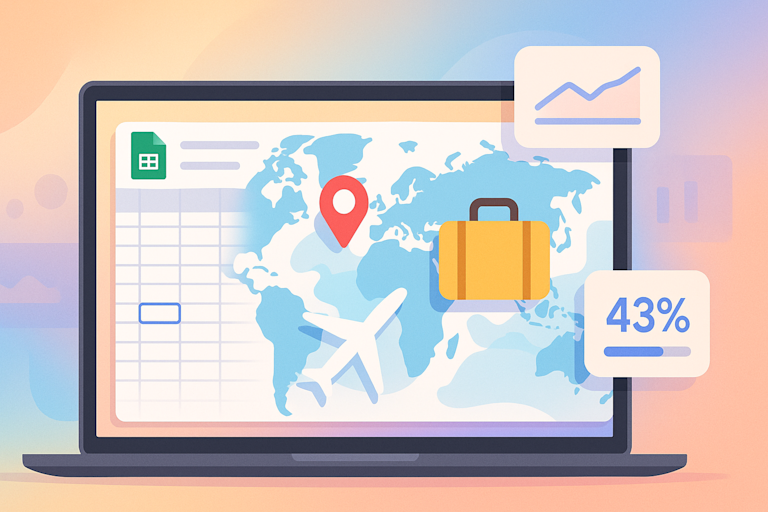
Travel Mapper is the highest-rated travel planning app that integrates with Google Sheets. It helps users organize and research their travel itineraries, saving time and effort. As a software-as-a-service (SaaS), it offers a free trial and when that ends, users need to pay for a subscription to access the premium features. I was part of a 3-member team that created Travel Mapper.
When the team and I were developing this app, a lot of effort was put into making it a great product whether it be adding features, making it easier to use, integrating analytics to track and understand user behavior, etc. This was all in an effort to provide maximum value to the user and hopefully increase the rate of conversion from free trial users to paying subscribers.
Tracking and Improving Conversion Rates
We measured the conversion rates all the way down the funnel from the number of installs to creating an itinerary to viewing the app pricing page to actual purchase. We logged all possible actions that users could take and created an extremely simple survey form to get feedback from users after they’ve completed a certain number of actions. This was to help feed our feature iteration flywheel and build according to data gathered from actual users to maximize the purchase conversion rate.
Among the many things that we learned along the way, one important lesson was that UIUX is extremely important. Without a designer, we were handicapped in the beginning and tended to design interfaces that were clunky and user experiences that poorly communicated to the user how the app was meant to work. We made a very rookie mistake, among many others, in making our subscription call-to-action (CTA) too hard to find.
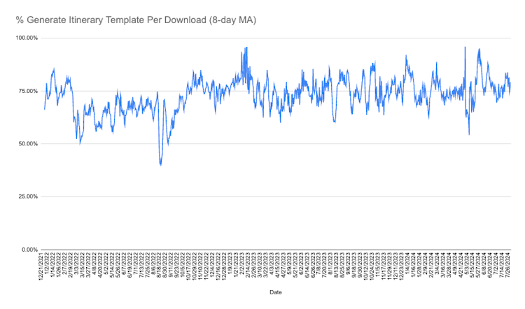
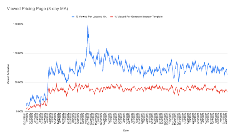
There is a dropdown menu that users would use to generate an itinerary template. This dropdown menu also has an option to purchase the subscription for the app. This was where the CTA was located. However, we realized that after the user generated an itinerary, they very rarely used this dropdown menu for anything. As a result, the number of users that generated an itinerary who then viewed the pricing page was extremely low. It was something like 10%-15% of people that generated an itinerary template then went on to view the pricing page.
Once we made the change to make the CTA super obvious and directly in the UI of the planner interface, this conversion roughly tripled to hover around 40%. In hindsight, this change was blatantly obvious but we had to make this mistake to learn this lesson.
Pricing Page Design and Experiments
Now, once the user was actually on our pricing page, converting them to a paying customer was a whole other problem that we had yet to realize and begin to tackle. For a long time, the pricing page for Travel Mapper looked like this:
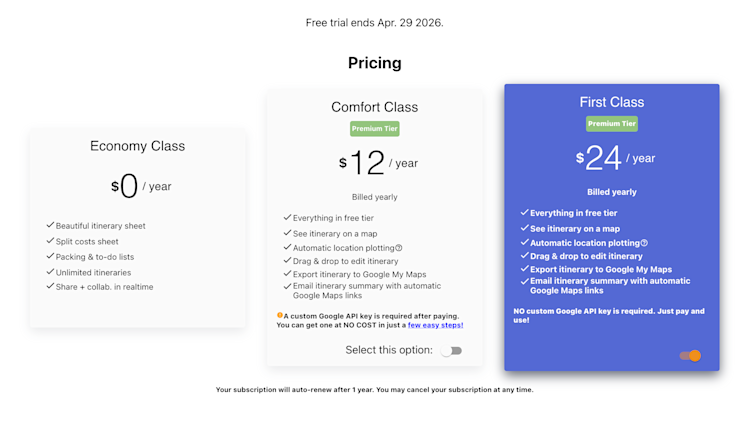
While not professionally designed, this pricing page was functional. It displayed information on what each subscription tier provided for the user. It provided a way to allow the user to purchase the subscription. And basically… that was it.
There wasn’t any additional information to build trust with the user like FAQs or testimonials from satisfied users. There wasn’t any other way to communicate the value differences between the various tiers to better communicate our value proposition. There was a lot of repeated information as well. Furthermore, the design of the pricing page wasn’t modern looking and didn’t convey the sense of professionalism that we wanted.
We also wanted to experiment with how displaying a discounted price, with a strike through and showing a percentage discount, would affect the purchase conversion rate. We wanted to experiment with pricing to see if prices displayed as monthly charges or annual charges or charging by whole dollars or increasing/decreasing prices had any effect on the purchase conversion rate.
So, we began to build these functions into the pricing page like the ability to swap out different offerings easily and the ability to change how the pricing information is displayed. Then, we would run experiments where we’d change one thing, measure the conversion rate for an amount of time, and then assess if the change had a beneficial effect or not. Granted, we understood that this wasn’t a completely scientific approach as there wasn’t an ideal control group to measure against. We didn’t have the time or resources to build that type of experimentation infrastructure although in hindsight, it might’ve been worth it to invest in that effort.
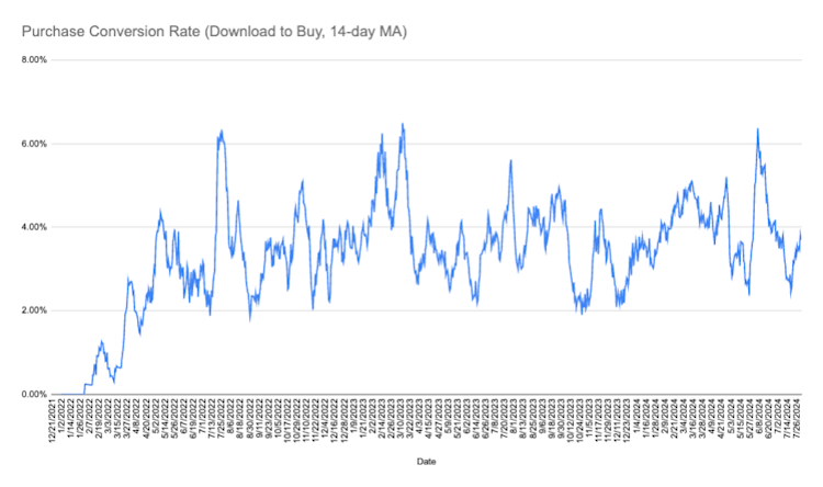
Nevertheless, we were able to, at the very least, learn that doubling our prices did not materially affect our purchase conversion rates by running an experiment over a sufficiently long period of time. However, we could’ve arrived at this conclusion much faster if we had the capability of proper A/B testing our pricing. We were essentially leaving half of the revenue on the table.
And eventually, we redesigned our pricing page’s look from scratch, making it much more professional, adhering to UIUX industry standards, and adding in social proof sections to communicate more trust, transparency and value to the user. This was a significant effort from our developers.
To tackle this issue for other SaaS founders, we’re developing Pricendio which allows launching a well-designed, high-converting pricing page with no code. With Pricendio, A/B testing for pricing experiments and tracking important metrics like conversion rate and total revenue are made simple so founders can make actionable decisions to optimize those metrics. This is something we wish we had for Travel Mapper early on.
Growth Marketing
As the Travel Mapper product became more mature, we wanted to grow by increasing the top of the funnel (i.e. getting more users). Naturally, we experimented with paid ads from Reddit to Facebook to Google. We spent roughly a quarter of our revenue that year and 8 months of time experimenting with paid ads. It resulted in essentially 0% return on investment (ROI).
Somewhat concurrently, we also experimented with paid blog posts and sponsoring YouTube videos in the travel blogging and vlogging industry targeting smaller, less prominent content creators. We spent about 10% of our revenue that year on this effort. For our type of app that helps users plan travel, the best performing blog or video content revolved around the content creator introducing their audience to a tutorial of our app and promoting it very directly. Other blog posts where our app was indirectly promoted or otherwise did not perform as well.
And while the better performing sponsored blog/video content had much better ROI and resulted in many more purchases than the paid ads, we still did not make back the investment in a timely manner.
The takeaway on this paid ads/sponsored content effort was that our SaaS, which cost $24 per year for a premium subscription, was priced too low to make growing the top of the funnel work in this way. The alternative solution for us was to do in-house content marketing by creating blog posts and YouTube videos that are highly targeted for users searching for keywords like “best travel planning app” or “best road trip app” or similar. These worked the best to convert readers/viewers to new users and then eventually to paid users.
Again, in hindsight, it was completely obvious that highly-targeted content would convert the best. However, we went about discovering this by writing a wide range of blog posts and making various videos spanning anything from travel vlogs to specific travel destination itinerary posts to how to camp in different vehicles posts. Within each of the various content, we would embed a 10% coupon that is unique to that post to incentivize users to sign up and purchase a subscription. After a while we’d gather the data on which coupons converted the most and concluded that that type of content worked the best.
Key Takeaways
- Clarity wins: Make your core actions, like subscribing, impossible to miss. Even small UX tweaks can triple your click-throughs.
- Measure everything: Instrument every step of your funnel and feed real user feedback into your roadmap.
- Test with purpose: Do quick, iterative pricing experiments with control groups to maximize conversion rate and long term value of customers. Test everything from copy to different price points.
- Content trumps ads: Highly targeted blog posts and tutorials drove far better ROI than generic paid campaigns.
We’ve redesigned our pricing page from the ground up, polished the UX, and doubled down on the content that resonates. If you’re building a SaaS of your own, start small, track every click, and let the data guide you. That’s how you turn curious trials into loyal customers.
Pricendio aims to help you launch a stunning, high-converting pricing page in minutes—no coding needed, perfect for small businesses, solopreneurs, indie hackers, and SaaS creators. Optimize your pricing page to maximize conversion rate and the long term value of customers using A/B testing experiments and track your important metrics all in one place.